Why Your Website Isn't Generating Leads — And Why It's Usually Not the Design
"We need a redesign" is a conclusion, not a diagnosis. Six reasons business websites fail to produce leads, in the order worth checking — most of which a redesign alone will not fix.
The call usually opens the same way: the website isn't working, so we need a new one. Sometimes that is right. More often the site is a symptom and the redesign is an expensive way to avoid diagnosing anything — which is how businesses end up on their third rebuild in six years, each one prettier and none of them producing more calls.
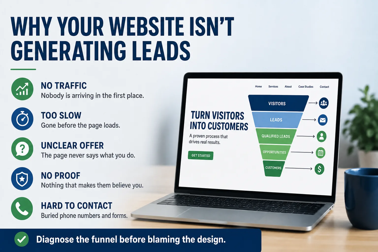
A website that generates no leads is failing at one of six specific points. They are worth checking in order, because the early ones are cheap to fix and the later ones are the only ones a redesign actually addresses.
1. Nobody is arriving
Check this first, always. Open your analytics and find how many people visited last month. If the answer is forty, no amount of persuasion on the page matters — a two percent conversion rate on forty visitors is not a lead, it is a rounding error.
A site with no traffic has a visibility problem, not a conversion problem, and the fixes are entirely different: pages that answer the questions people actually search, a maintained Google Business Profile, consistent listings, structured data. Rebuilding the design changes none of that. Start with What It Actually Takes to Rank in Your Own City instead.
2. They are arriving and leaving before the page loads
If traffic is decent and leads are not, look at how long the page takes on a phone. A site that takes six seconds on cellular sheds a large share of its visitors before they read a word, and those people never register as anything except a bounce.
This is the cheapest possible failure to check — a speed test takes a minute — and one of the most common. It is also the one where the fix has the clearest return, which we walk through in Is a Fast Website Worth It?.
3. The page never says what you do
Open your homepage and read the first thing a stranger sees. A startling number of business sites lead with something like "Excellence Through Innovation" over a stock photo, followed by a paragraph about being founded on a commitment to quality.
A visitor who landed from a search has one question and about four seconds of patience for it: is this the business that does the thing I need, where I am? If the answer is not visible without scrolling, they leave — not because the design is ugly, but because they could not confirm they were in the right place.
The fix is nearly free and rarely done: say what you do, for whom, and where, in plain words, at the top. "Commercial roofing for schools, hospitals, and municipal buildings across Los Angeles, Orange, Riverside, and San Bernardino counties" is not poetry. It is unambiguous, which is worth more.
4. There is nothing that makes them believe you
Somebody is about to let a stranger onto their roof, into their crawlspace, or into their supplier list. They are looking for reasons to feel safe, and most business sites supply none.
The evidence is usually sitting in a filing cabinet: license numbers, insurance status, certifications with the issuing body named, years in business, named people with real titles, actual project photos with actual details, reviews you did not write. Rite-Way Roofing held more than fourteen manufacturer certifications that had never appeared anywhere on their old site. Publishing them was not decoration — for an institutional buyer it is the entire qualification step.
This matters more the higher the stakes. Regulated and technical buyers actively verify. When we rebuilt QTC, an FAA Part 145 repair station, giving their FAA, EASA, and UK CAA approvals dedicated pages was not marketing polish; it was the difference between being verifiable and being taken on faith by people who do not take suppliers on faith.
5. Contacting you is harder than it looks
Watch someone try to contact your business from their phone. Not describe it — do it, and time it.
The common failures are mundane and expensive. The phone number is an image, or plain text that does not dial when tapped, or only in the footer. The form asks eleven questions including budget range and how they heard about you, when a name and a phone number would do. The form submits into an inbox nobody has checked since the office manager left. There is one call-to-action, on the homepage, and none on the service page where the visitor actually formed the intent.
For Ancla Plumbing we put a sticky Call and Text bar on the bottom of every mobile screen, because a homeowner with water spreading across a floor is not going to scroll hunting for a contact page. That is not a design flourish. It is removing the last three seconds of friction from someone who is already ready.
Worth separating out: a form can fail at three distinct points — the form itself, the delivery, and the response — and a form that stopped delivering months ago looks exactly like a slow quarter. We took that apart in Why Nobody Fills Out Your Contact Form, including the five-minute test that tells you which one is happening to you.
6. The traffic is real, but it is the wrong traffic
The subtlest failure. You rank, people arrive, nobody converts — because they were never buyers. You rank for informational searches from people researching how to do it themselves, or from three states outside your service area, or for a service you technically list and do not want.
The tell is in the pages. If your best-performing page is a how-to guide and your service pages get nothing, you have built an audience rather than a pipeline. The fix is to build out the pages that match buying intent — specific services, specific places, specific problems — rather than pushing more volume through a page that attracts readers.
So when is it actually the design?
Sometimes it genuinely is. A site that looks like it was built in 2012 signals a business that might not still be operating, and in credibility-sensitive fields that judgment happens in seconds and is nearly impossible to argue with afterward. If your site is visibly dated, breaks on a phone, or looks materially less serious than the competitors a buyer is comparing you against, appearance is doing real damage.
But notice that in every one of the six failures above, the site could be beautiful and still produce nothing. That is why "we need a redesign" is worth converting into a question — which of these six is actually happening here? — before anyone quotes a number. Frequently two or three are true at once, and only one of them needs a rebuild to fix.
If you want that read on your own site, we do it in about fifteen minutes on a call, and you will get the honest answer including "do not rebuild this yet." Details on how we work are on the pricing page; the fastest start is just to get in touch.