Why Nobody Fills Out Your Contact Form
A contact form has three separate failure points, and business owners almost always inspect only the first. How to find out which one is costing you leads — this afternoon, for free.
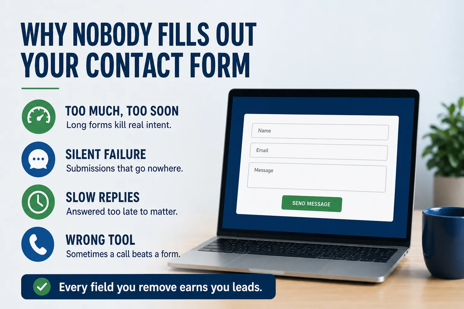
The traffic looks fine. The site loads. Nobody is calling.
When that happens, attention goes straight to the form's appearance — the button colour, the headline above it, whether it should move higher on the page. Those are real considerations and they are almost never the problem. A contact form fails at one of three distinct points, and only the first is visible from the outside.
The form has to be worth filling out. The submission has to arrive somewhere a human reads. And somebody has to respond fast enough to matter. A failure at any one of those looks identical from your desk: silence.
Failure one: the form asks for more than the moment deserves
Someone who has decided to contact you is at peak intent and it decays by the second. Every field is a small tax on that intent, and business owners consistently overcharge.
The usual offender is a form built around what would be convenient for your intake process rather than what the visitor is willing to give a stranger. Budget range. How did you hear about us. Preferred contact method. Project timeline, as a dropdown, with options that do not describe their situation. Each one is defensible in isolation and collectively they convert a thirty-second action into a form someone decides to come back to later, which means never.
The honest question for each field: would you rather have this answer, or the lead? Because for most businesses a name and a phone number is enough to start a conversation in which every other answer emerges naturally. You can qualify on the call. You cannot qualify someone who left.
The second offender is placement. Many sites have exactly one contact form, on the contact page, while the intent forms on the service page — the one that actually convinced them. If a visitor has to navigate to act, some fraction will not. A contact path belongs on every page that does persuasive work, not only the one named after it.
Failure two: the submission goes nowhere
This is the failure nobody suspects and it is far more common than it should be. The form appears to work. It shows the thank-you message. The submission is not delivered.
The causes are mundane. The delivery address is an old employee's inbox. The endpoint was configured by a developer who has since moved on and the account lapsed. A plugin update quietly broke the mail function eight months ago and no error was ever surfaced, because a broken form fails silently by design — the visitor sees success either way. Or submissions arrive perfectly and land in a spam folder nobody opens, filtered because they are automated mail from a domain that does not match the sender.
There is no monitoring on any of this unless somebody deliberately set it up. A website that stopped producing leads eight months ago and a website that has been quietly discarding them look exactly the same in your analytics.
The architecture matters here more than it sounds. On Ancla Plumbing we run three separate inquiry paths — general contact, Zoom consultation, and careers — through a single form endpoint, each carrying a hidden form-type field and a distinct subject line so submissions triage themselves on arrival. Three doors, one delivery path, one thing to verify. Three separate integrations would have meant three things that can silently break and two you would probably never check.
Failure three: it arrived, and nobody answered in time
The form worked. The email landed. Someone read it Tuesday morning after it arrived Friday afternoon, and by then the job was gone.
This one sits outside the website, which is exactly why it survives so long — it is nobody's job, so nobody measures it. But a person who filled out a form for you filled out two or three others the same evening, and the sequence of replies decides the outcome more reliably than the quality of any of them. Being first is a large share of the game, particularly for anything urgent.
The practical fixes are unglamorous. Route submissions to a place that pushes a notification rather than one you check — a phone, not a desktop mail client somebody opens twice a day. Send the customer an immediate acknowledgement so they know they reached a real business and stop shopping. Decide who owns after-hours inquiries and what "after hours" means for a trade where the emergency *is* the business.
If your response window is genuinely long, say so on the form. "We reply within one business day" sets an expectation you can meet. Silence sets one you cannot.
Sometimes the form is the wrong instrument entirely
A form is asynchronous. Some customers are not.
A homeowner watching water spread across a floor is not composing a message. They want a phone number their thumb can reach, and if the number is an image, or plain text that does not dial when tapped, or living only in the footer, you have lost to whoever's number was easier. This is why we put a sticky Call and Text bar along the bottom of every mobile screen on Ancla — not as a design flourish, but because the last three seconds of friction are the expensive ones.
The same instinct drives Gun Boss, where the entire objective is foot traffic and the mobile bar hands straight off to Apple Maps or Google Maps in one tap, and Rite-Way Roofing, where the phone number and scheduling sit in the header on every page because the buyer is often a facilities manager with a roof failing right now.
Match the instrument to the urgency. Forms suit considered purchases where someone is comparing and gathering information. Phone and text suit emergencies. Most businesses need both and publish only one.
The spam problem, and the cure that costs more than the disease
Every public form attracts junk, and the standard response — a CAPTCHA — is a conversion tax paid by every legitimate visitor to deter a bot that is often not deterred anyway. Puzzle challenges are worst: they punish exactly the people least likely to persist, which includes older customers and anyone on a phone in poor light.
The quieter approach is a honeypot: a hidden field that humans never see and never fill, which automated submitters fill reliably. Anything with that field completed gets discarded. No friction for a real person, no puzzle, no third-party script slowing the page. That is what runs on the David Plotkin practice site, where the visitor is frequently someone anxious reaching out for the first time and every additional obstacle is a reason to reconsider calling at all.
If spam volume genuinely warrants more, escalate to an invisible check before a visible one. Reach for a puzzle only when you have measured that the spam is worse than the visitors it will cost you.
Test yours this afternoon
Take out your phone — not your laptop — and submit your own form as a customer would, with a real message. Time how long the page takes to load, count the fields, and see whether you can dial the business without hunting.
Then check whether it arrived. In the inbox, and in the spam folder. If it did not, you have found something worth more than any redesign. If it did, note the timestamp and ask honestly how long a real inquiry would have waited.
Repeat it once a quarter, forever. A form is the one part of a website that can break completely while appearing to work perfectly, and the only way to know is to use it. If the form checks out and leads are still thin, the problem is upstream — work through the six reasons a website fails to generate leads and start where the evidence points.